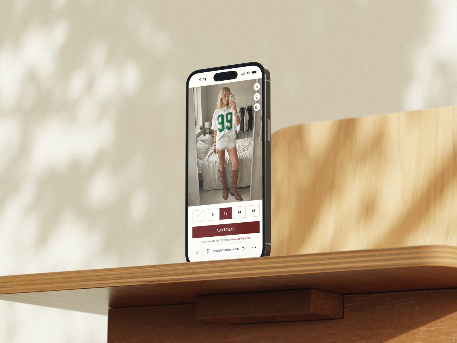
Debenhams Group
One scaled design system serving 21 brands. Feature delivery cut from months to days, and conversion wins of up to +11.7%.
- Role
- UX Designer
- Dates
- August 2023 to present
The Challenge
After boohoo group acquired Debenhams, the Debenhams team ran like a startup, building our own tech stack and making sure we were self-reliant and operational as soon as possible, rather than leaning on the existing boohoo group tech infrastructure.
The first live version of the website had been built quickly, and the app from a simple reference template. There was no design structure, no shared components and no rigour: teams were simply shipping. That was the start of the first Debenhams design system and some simple Discovery > Design > Development processes.
Then the brief grew, significantly. I moved to report directly to the CTO, with a mandate to take the system and processes we'd built for Debenhams across the whole Debenhams Group portfolio, including boohoo, boohooMAN, PrettyLittleThing, Karen Millen and many more brands. The business also wanted to ship fast, so there was little appetite for anything that slowed the pace while we scaled the capability.
The challenge was building rigour into speed. One system we could maintain, design, build and ship from quickly, without losing what makes each brand distinct.
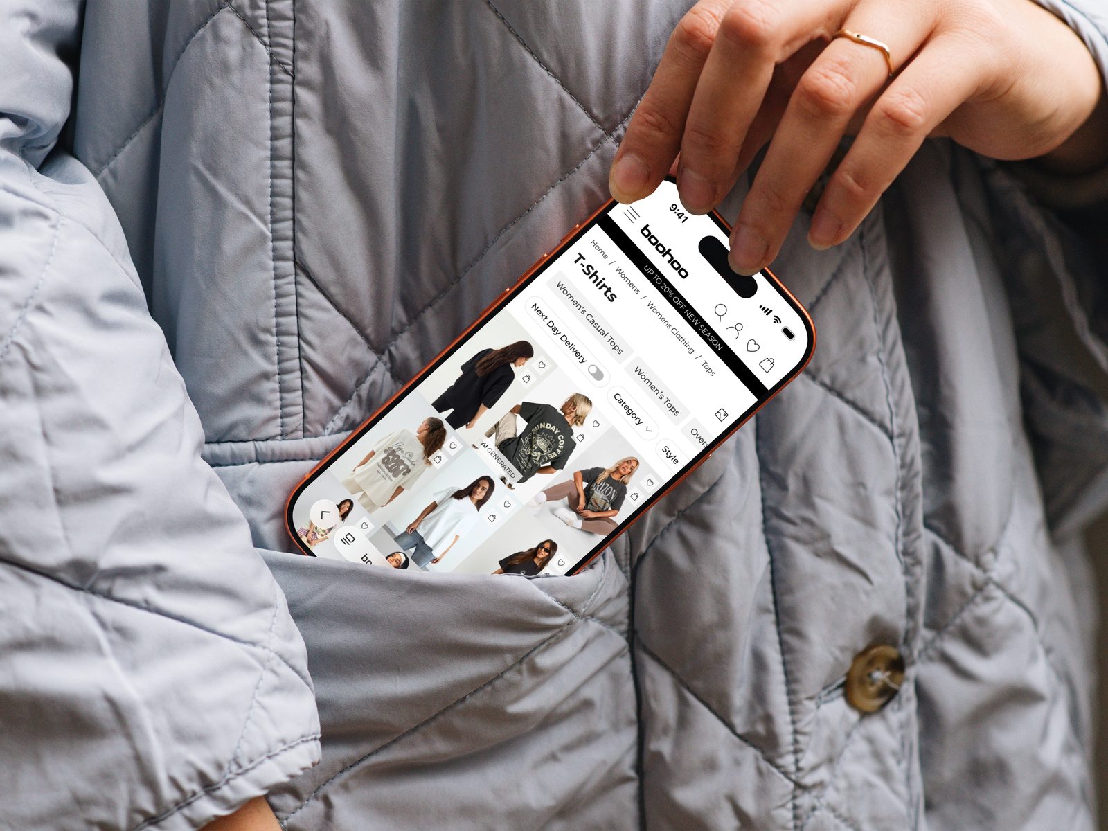
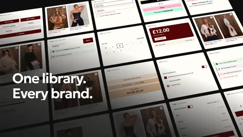
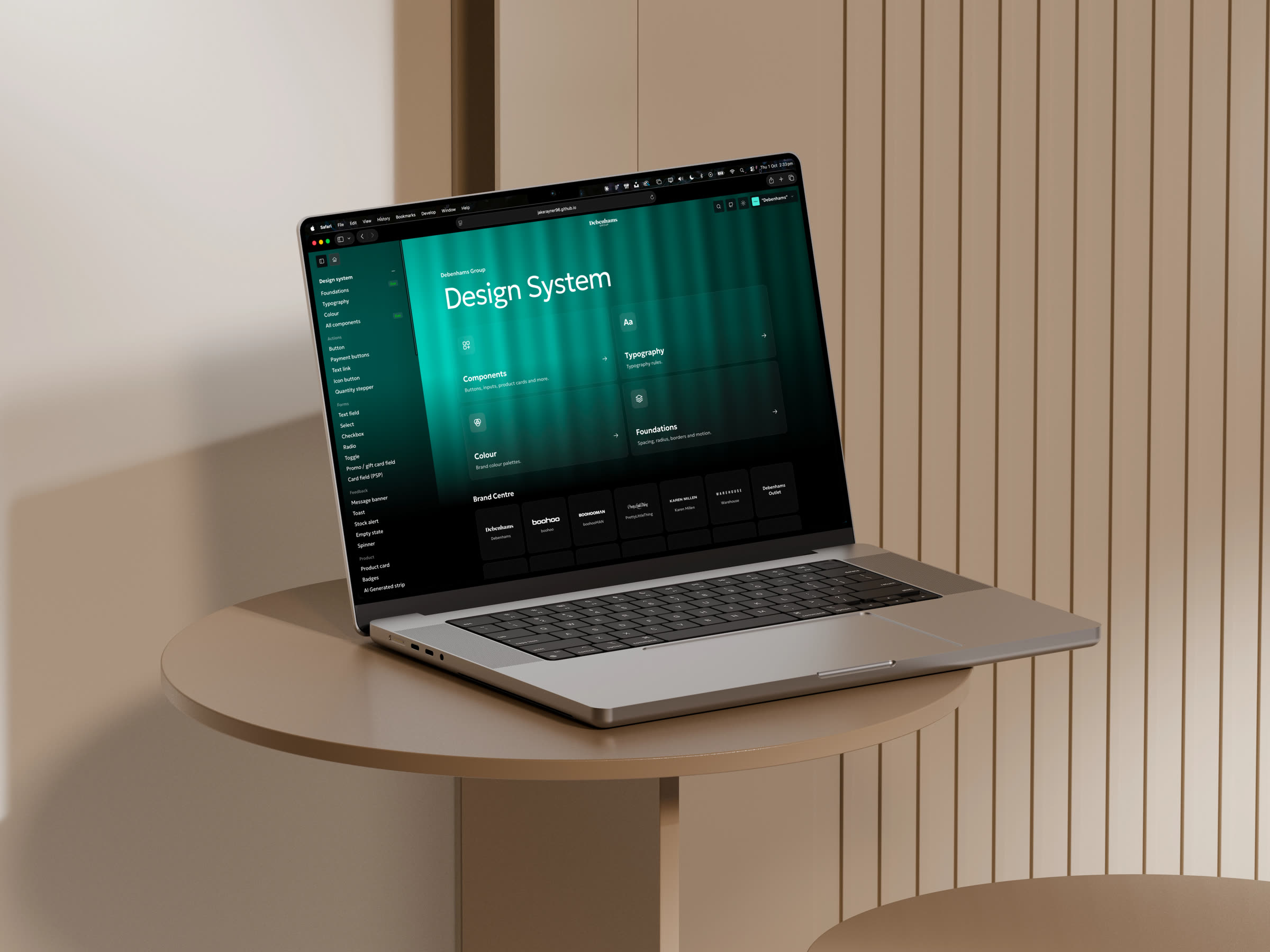
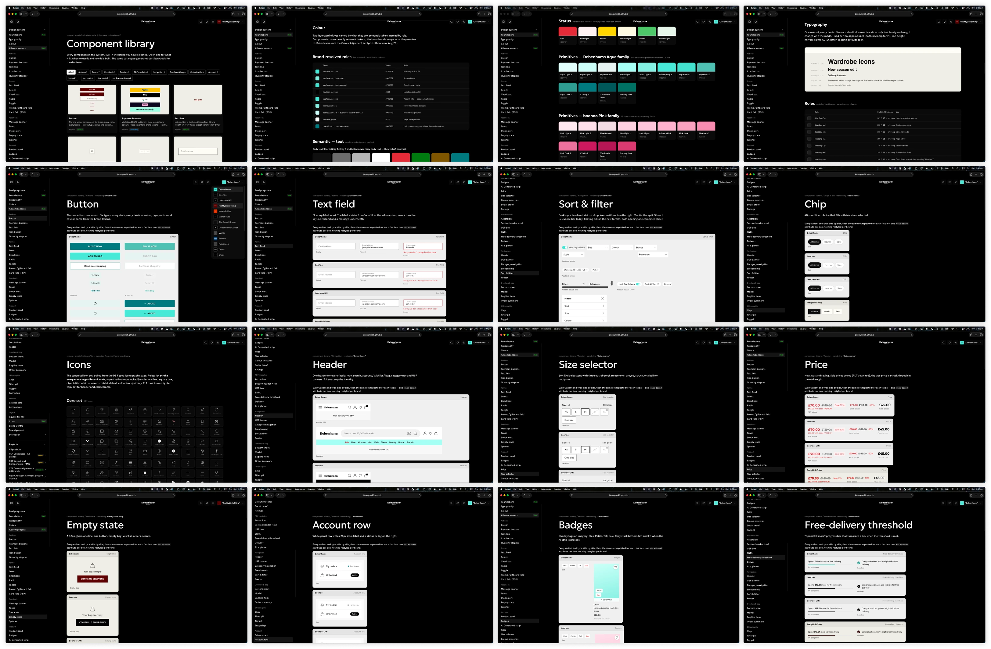
One Group-Wide Design System, Every Brand Covered
The system is built code-first, with Figma designs and specifications feeding into the workflow downstream.
Primitives, Then Semantics
Raw values, like a hex colour or a font size, are stored once as primitives. Components never use them directly. They use semantics, which are role names, like "action colour" or "page background", and each brand decides which primitive value each role points to.
One Switch per Brand
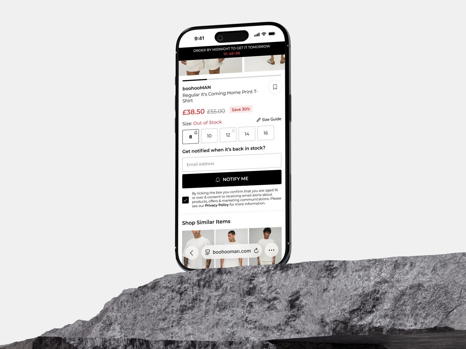
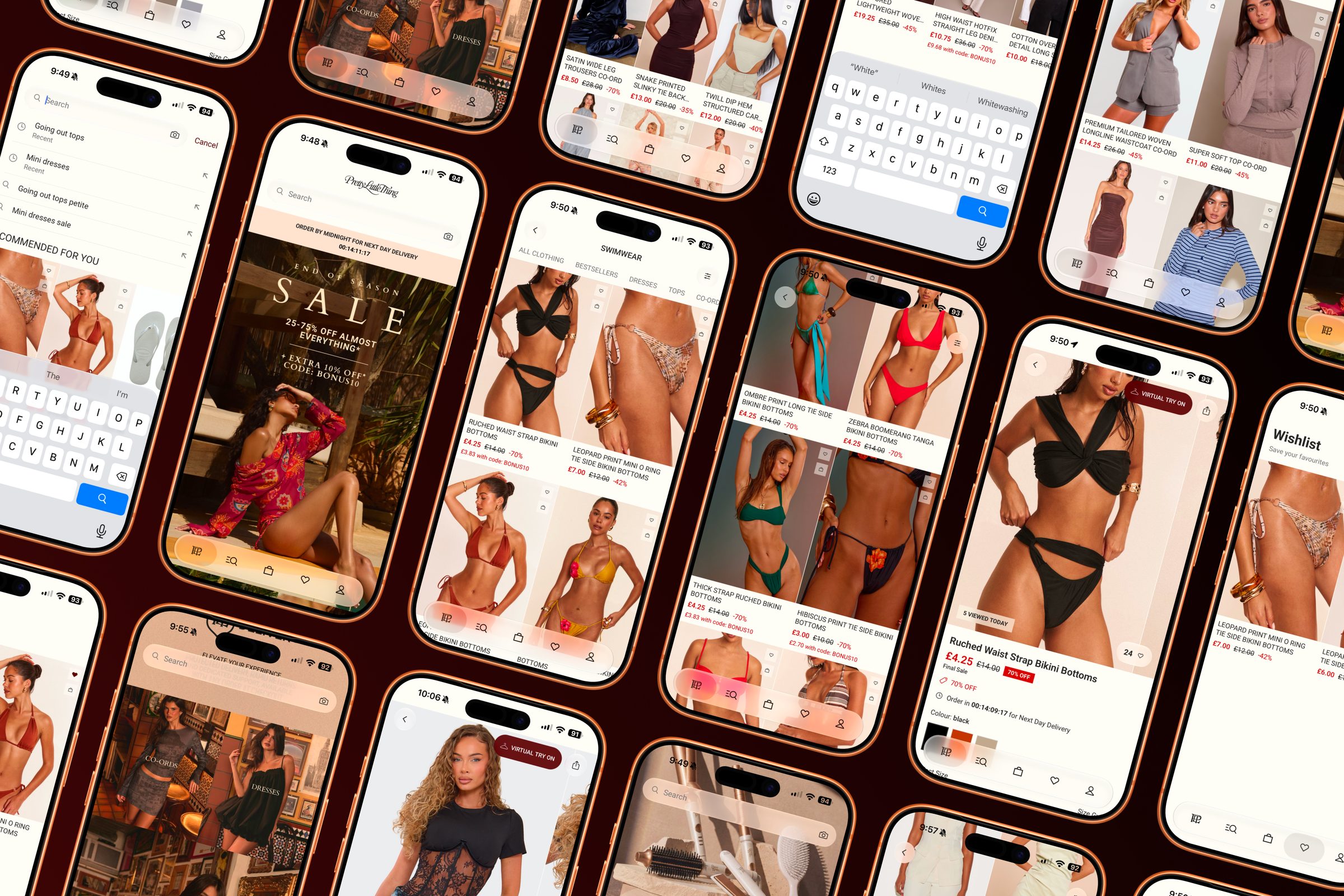
One setting tells every page, component and token which brand it's in, both for us in design and for the developers, swapping colours, typography, and every component on the site. Every brand runs on the same components, with no per-brand stylesheets. We call this The Framework.
Accessible by Default
Every component targets WCAG 2.1 AA compliance: 4.5:1 text contrast, touch targets, visible focus states, reduced-motion support and more, built into the system by default.
A Shared Library
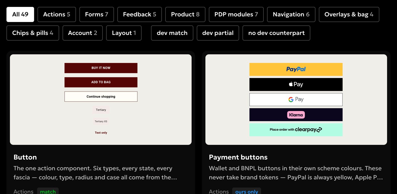
Inputs, buttons, product cards, PLP, PDP, bag and checkout kits, plus a library of 136 icons and much more.
-
01
Primitives
Raw values: colour, type, spacing
-
02
Semantic Tokens
Named by role
-
03
Brand Mode
One attribute, 21 brands
-
04
Components
18 families, 1000+ components, 136 icons
-
05
Breakpoints & Touchpoints
App, mobile web, desktop
Aligning 21 Brands to a Single Roadmap
I run a bi-weekly UX alignment forum with the e-commerce and creative leads from every brand, covering design reviews, feedback and sign-off, plus a monthly UX ideation workshop for longer-term ideas.
CRO, Test and Learn
The business moved fast, so there was little room for pre-launch discovery and research beyond benchmarking against industry best practice.
The group's focus was on launching changes, features and functionality, then measuring how they performed live, either as an A/B test or a full rollout. Custom AWS dashboards tracked the impact on the bottom line through metrics like average order value and conversion.
Rather than one big release, we put variants live with clear hypotheses, measured them, kept the winner, and kept iterating and improving based on the data.
Over three years, I helped the team run 100+ A/B tests across the group's brands, measured on conversion, average order value, revenue per user and checkout completion.
- +11.7%ConversionShop By Fit, Karen Millen
- +2.3%ConversionAI-generated review summaries, plus +1.5% revenue per user
- +2.2%ConversionBag product recommendations, Debenhams
- +1.8%ConversionCheckout address CTA redesign
- 4.1%ConversionClick and collect, up from 3.5%
Outcome
When I joined, Debenhams had no design structure, no shared components and no process. Today the whole group designs and builds from one system, across 21 brands.
Alongside the design system came a new way of working: a clear Discovery > Design > Development process, a regular UX forum feeding one roadmap, and features that reach every brand in days rather than months. UX is now part of how the business makes decisions, not an afterthought.
That includes how it measures success. 100+ A/B tests have run on live traffic, with conversion wins of up to +11.7% from Shop By Fit at Karen Millen and +2.3% from AI-generated review summaries.