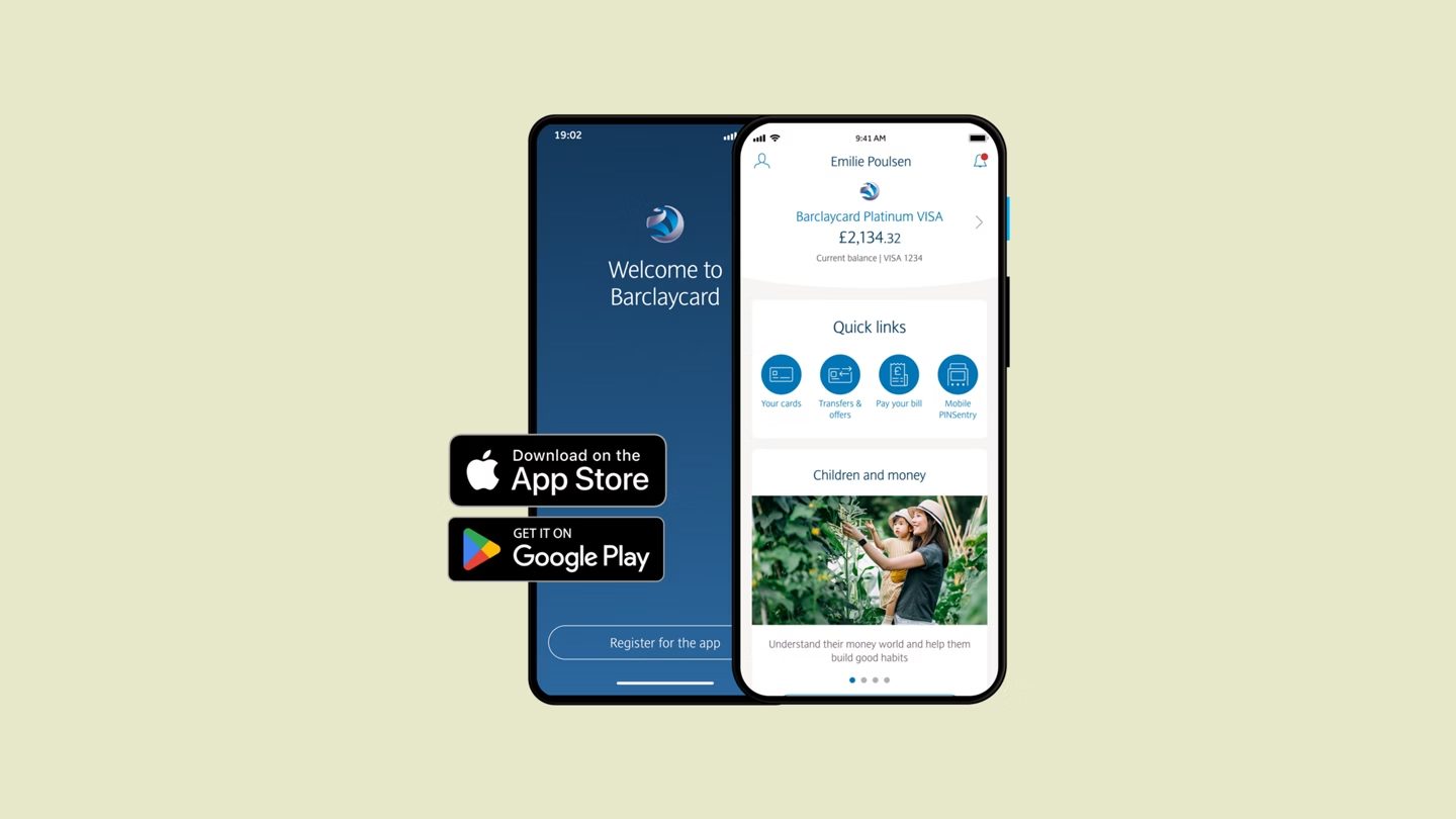
Barclays
+80% increase in mobile banking registrations, active users up from 3 million to 6.5 million+.
- Role
- UX/UI Designer, and Creative Consultant in the Innovation Team
- Dates
- Mobile Banking 2015 to 2016 · Innovation Team 2014 to 2015
Overview
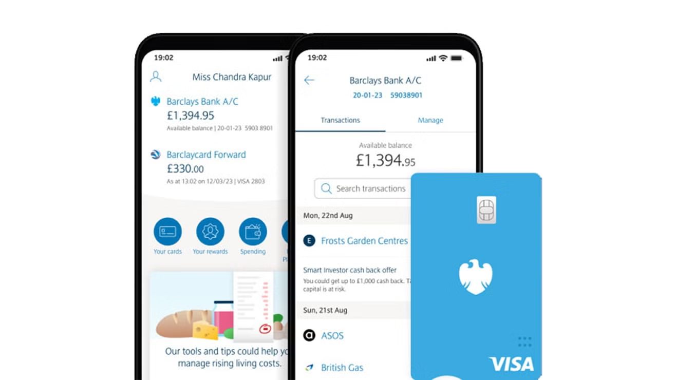
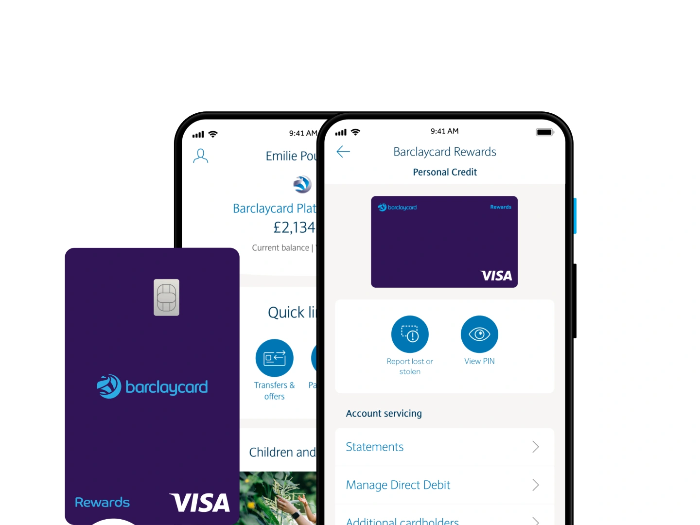
I helped transition Barclays' design from external partners to a new in-house UX/UI capability for Barclays Mobile Banking, Barclaycard and Pingit, building the first mobile design language and UI kit. The in-house design operation grew from 10 to over 600 people.
I defined and delivered designs across Barclays' digital touch points, with a focus on the native mobile apps, and delivered features that supported growth from 3 million to 6.5 million+ active mobile banking users in under 12 months.
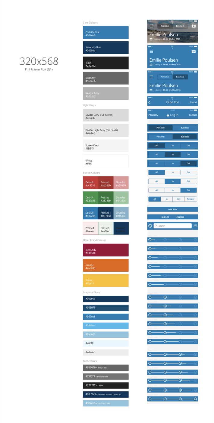
Mobile Design Language Update
When I first joined the Barclays Mobile Banking design team, it was moving from an outsourced to an in-house design team, and all the design work previously done by a digital agency was being handed over.
Barclays' mobile design language was outdated. I was regularly tasked with UI exploration to bring in the latest design trends and rejuvenate Barclays' digital products: exploring, prototyping and defining new components, sub-brands, style guides, interaction patterns, icons and graphics, to a pixel perfect and AAA accessible standard.
I also worked regularly with the corporate identity and brand teams, keeping the digital products and the brand guidelines aligned.
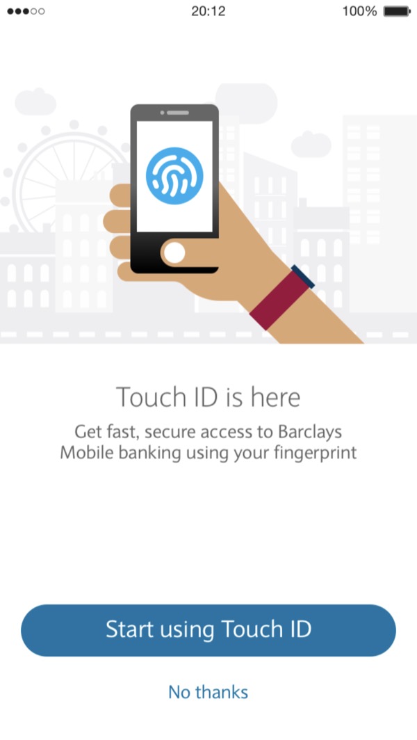
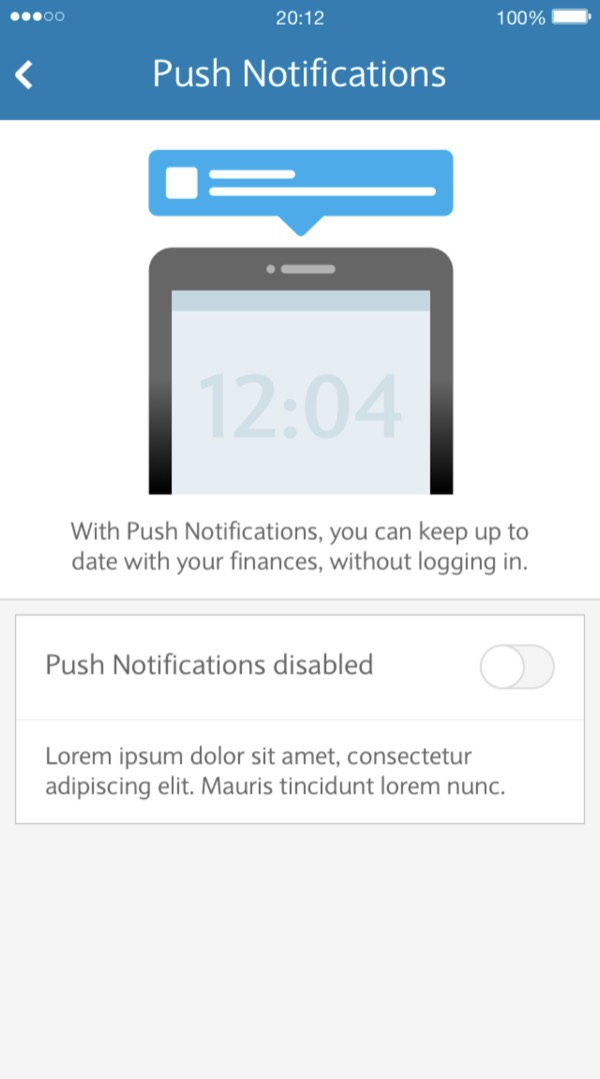
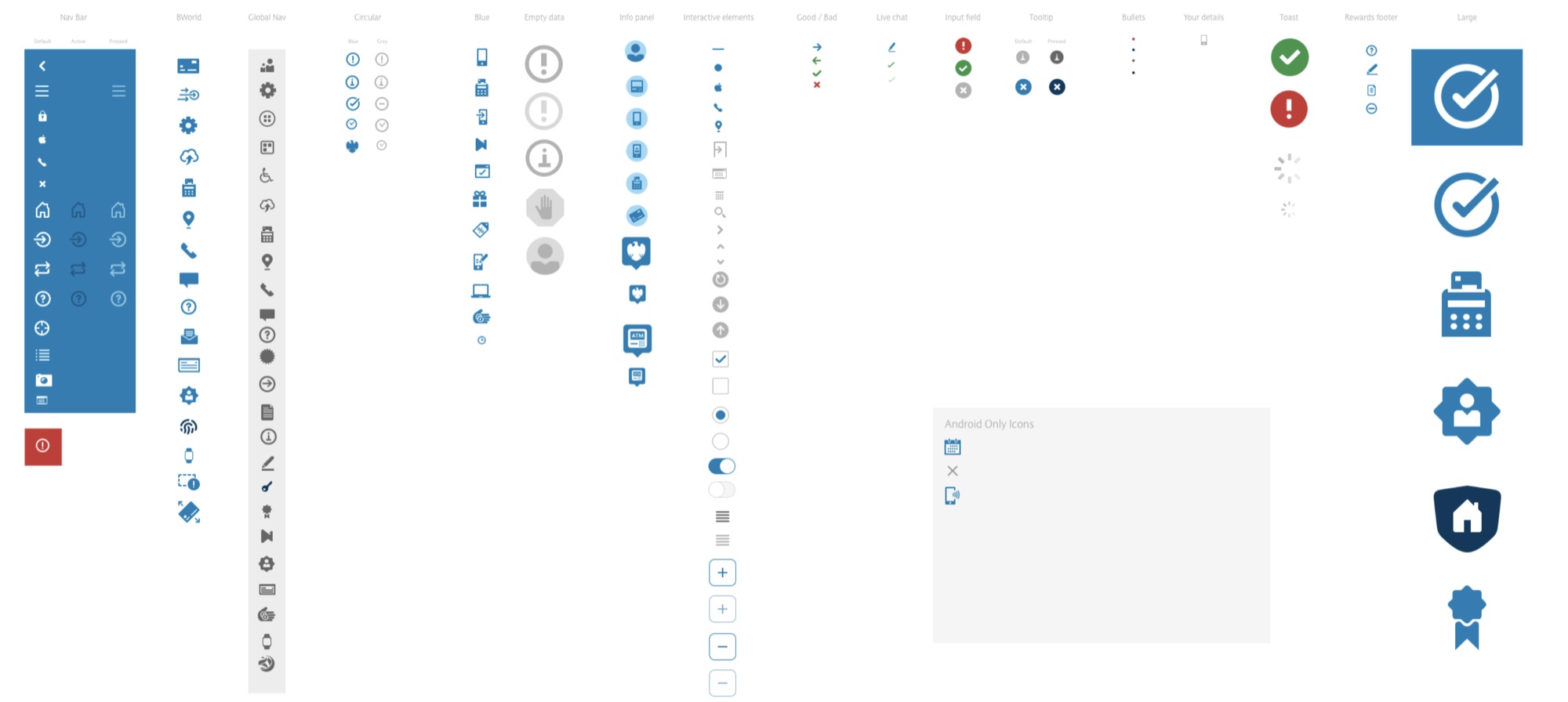
Mobile Component Library
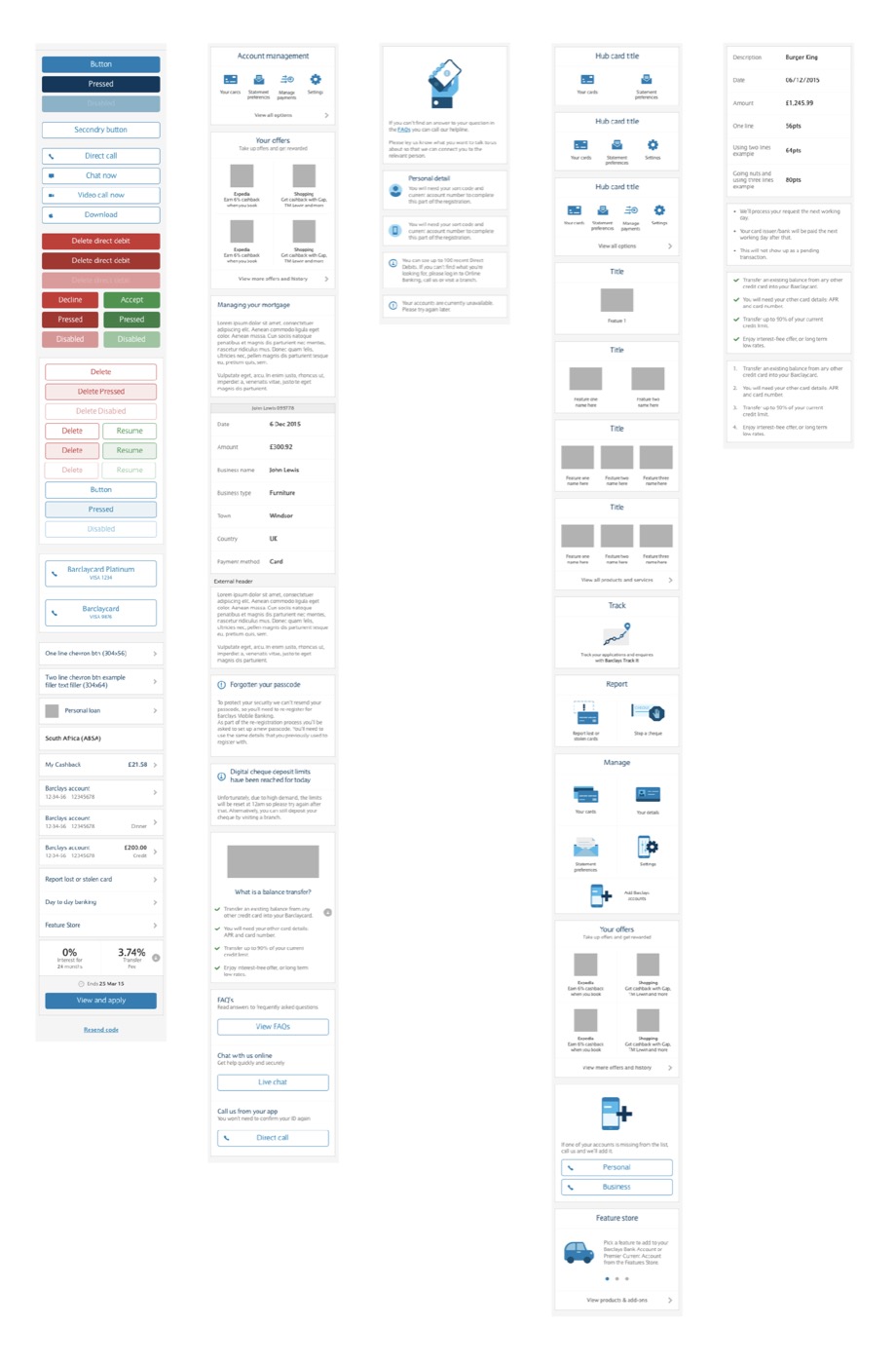
I helped to establish and maintain a component library for the mobile design teams at Barclays.
With over a million active users, consistency, habitual behaviours and repeatable, easy to use patterns were key to a simple and effective experience.
Every new component proposed was subject to strict validation through user research, to make sure usability wasn't disrupted, value was being delivered to the customer, and visuals weren't being prioritised over usability.
Once validated, new components went live through regular, incremental updates rather than major overhauls, to minimise disruption and let users adapt to new patterns while still managing their finances without an issue.
BMB Lite
Almost 30% of users who started a Barclays Mobile Banking (BMB) registration didn't complete it. Barclays wanted to understand why, reduce or remove the friction in the registration process, and increase the number of active users to support its wider digitalisation efforts.
Discovery
The first step was to research and understand three things: where the friction points were in the registration flow, why exactly users weren't completing their registration, and how we could solve the problem without compromising app security. To answer them, I ran:

Customer focus group discussions and diary studies.
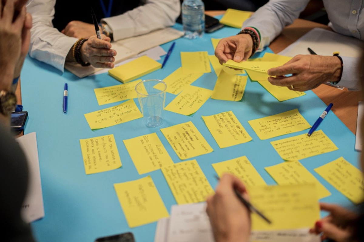
Workshops with the UX and product team to analyse the onboarding journey.
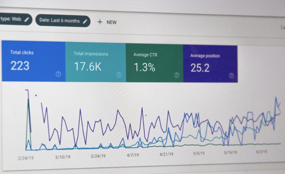
Analysis of the live mobile banking onboarding journey analytics.
What Did We Find Out?
Users were dropping off at the last step of the journey, where they needed to either visit an ATM or use a PINsentry card reader to complete their registration.
Visiting an ATM was inconvenient. People were often registering for the app in the evening at home, before bed or at work.
Users had lost their PINsentry card reader, it had run out of battery, or they didn't own one.
Because of this, some users had low expectations of what the app would be like to use after signing up, and were more reluctant to complete the registration.
Design Exploration
I began exploring solutions to the problems we'd identified, using two techniques.
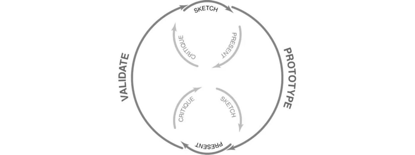
Lean UX
I designed a number of low-fi solutions, presented them to the design team for feedback, refined and iterated on them, then tested the refinements as prototypes with the design team and other colleagues.
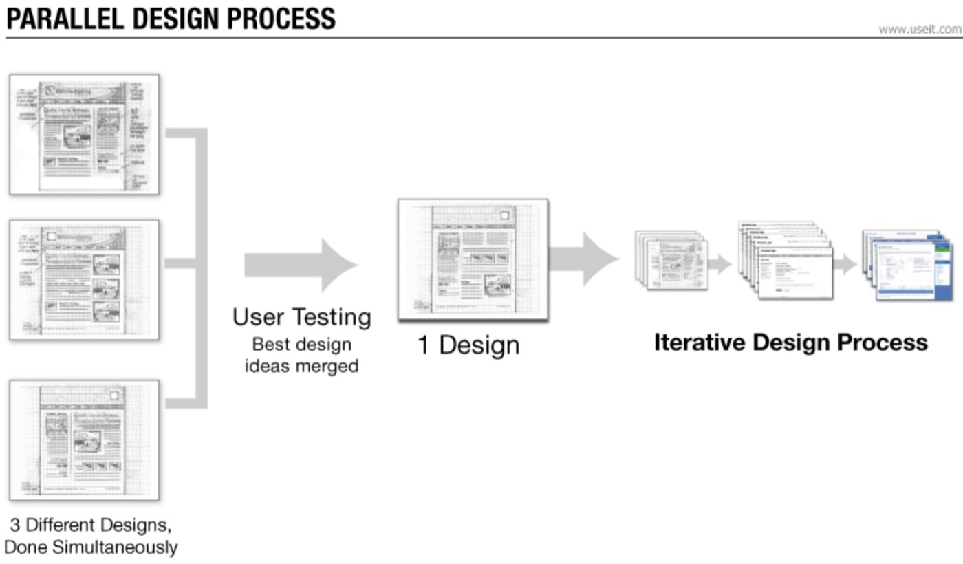
Parallel Design
The UX lead and I each independently ideated, designed, prototyped and tested a number of solutions, then came together to review our designs and insights, combining the best of both into a final proposal.
Validation
Barclays' design ethos was that every solution had to be tested thoroughly and validated before going live. Letting people manage their money with ease matters. Once we had a recommended solution, the next step was user testing.
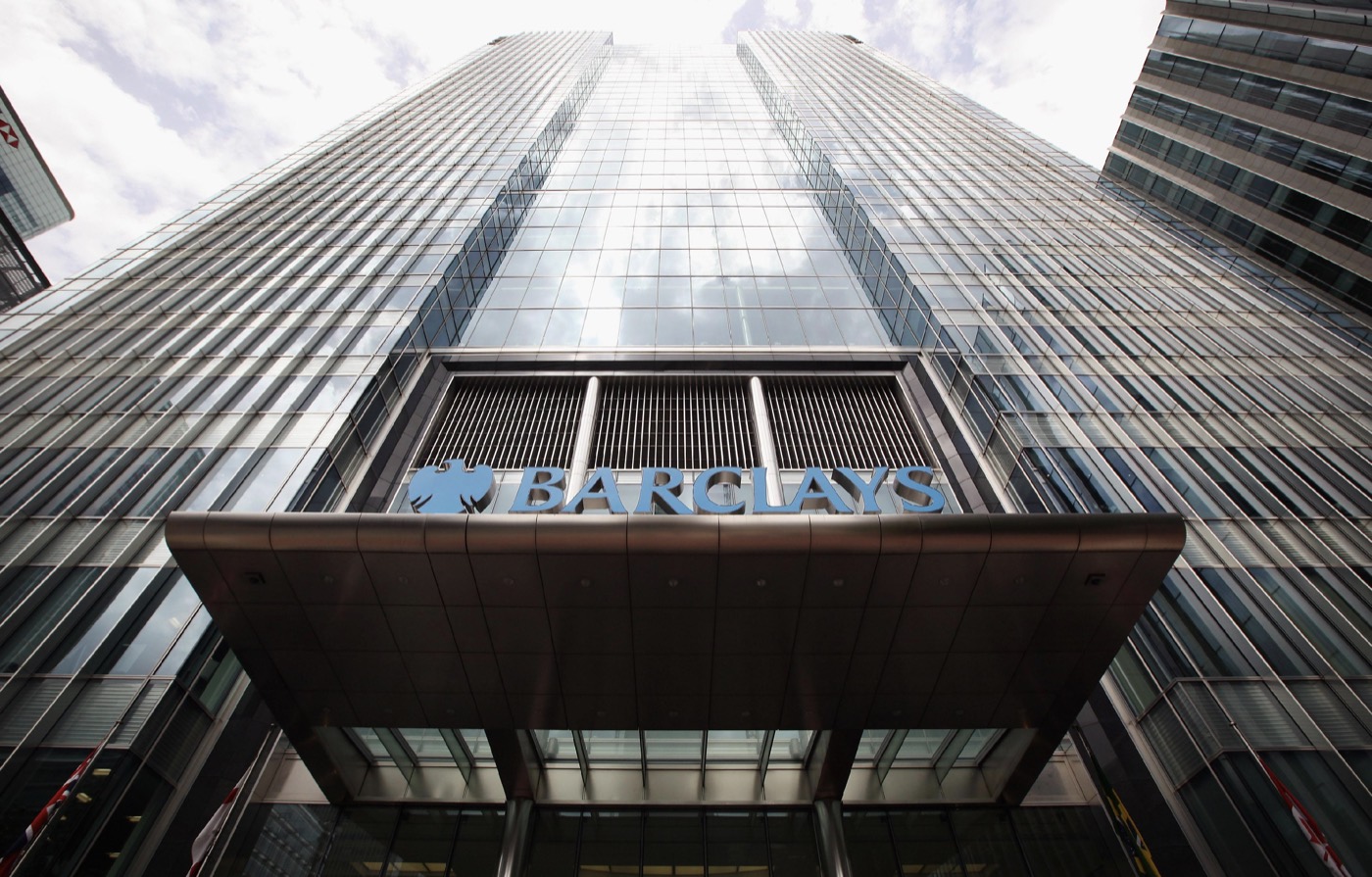
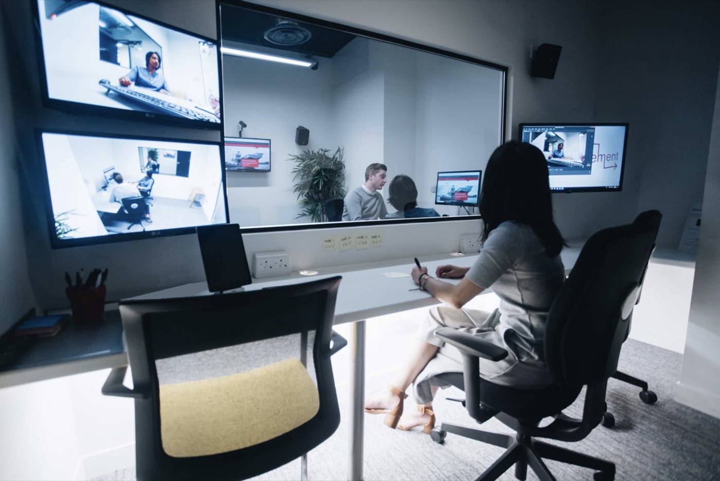
I started by bringing in our research partners EySeren to run a moderated user testing session with actual Barclays customers. Customers were invited to Barclays' HQ in Canary Wharf with a formal invitation letter, and paid as a thank you for taking part. EySeren tested a high-fidelity prototype, asked participants follow up questions, and produced a RAG report of their findings and recommended changes.
But There Was a Problem
We weren't getting valid insights back from users.
Participants had been formally invited by Barclays to an intimidating skyscraper in central London. They had dressed up smart, gratefully accepted their payment, been welcomed with a coffee, escorted to the lift and up to the 23rd floor, and then we wanted them to tell us what wasn't so good about the solution they were testing.
The red carpet had been rolled out, customers were bedazzled, and it was introducing bias into the results. Everyone thought the solution was amazing, but was it true and honest feedback?
Aware of the bias, and to substantiate EySeren's insights, I ran my own guerrilla testing of the same solution in Manchester. I designed a roller banner, placed it outside a coffee shop, and asked people if they could spare five minutes in exchange for a free coffee. I ran over 30 rapid tests in one morning, where participants performed a task on the prototype and then filled in a quick questionnaire. It gave me unprepared, genuine feedback on both the concept and its usability.


The Solution: BMB Lite
Managing Expectations
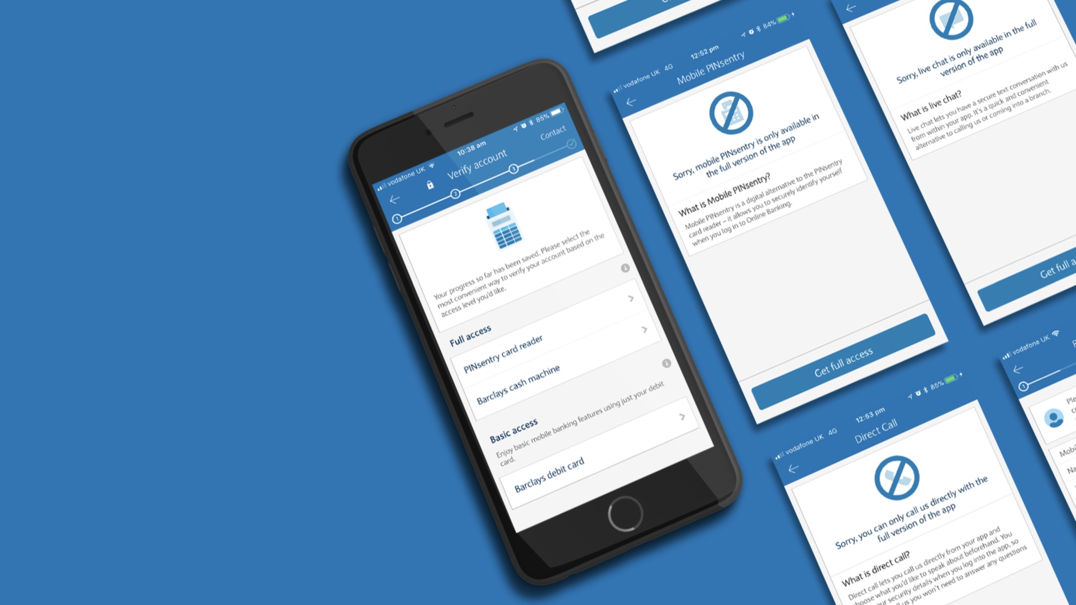
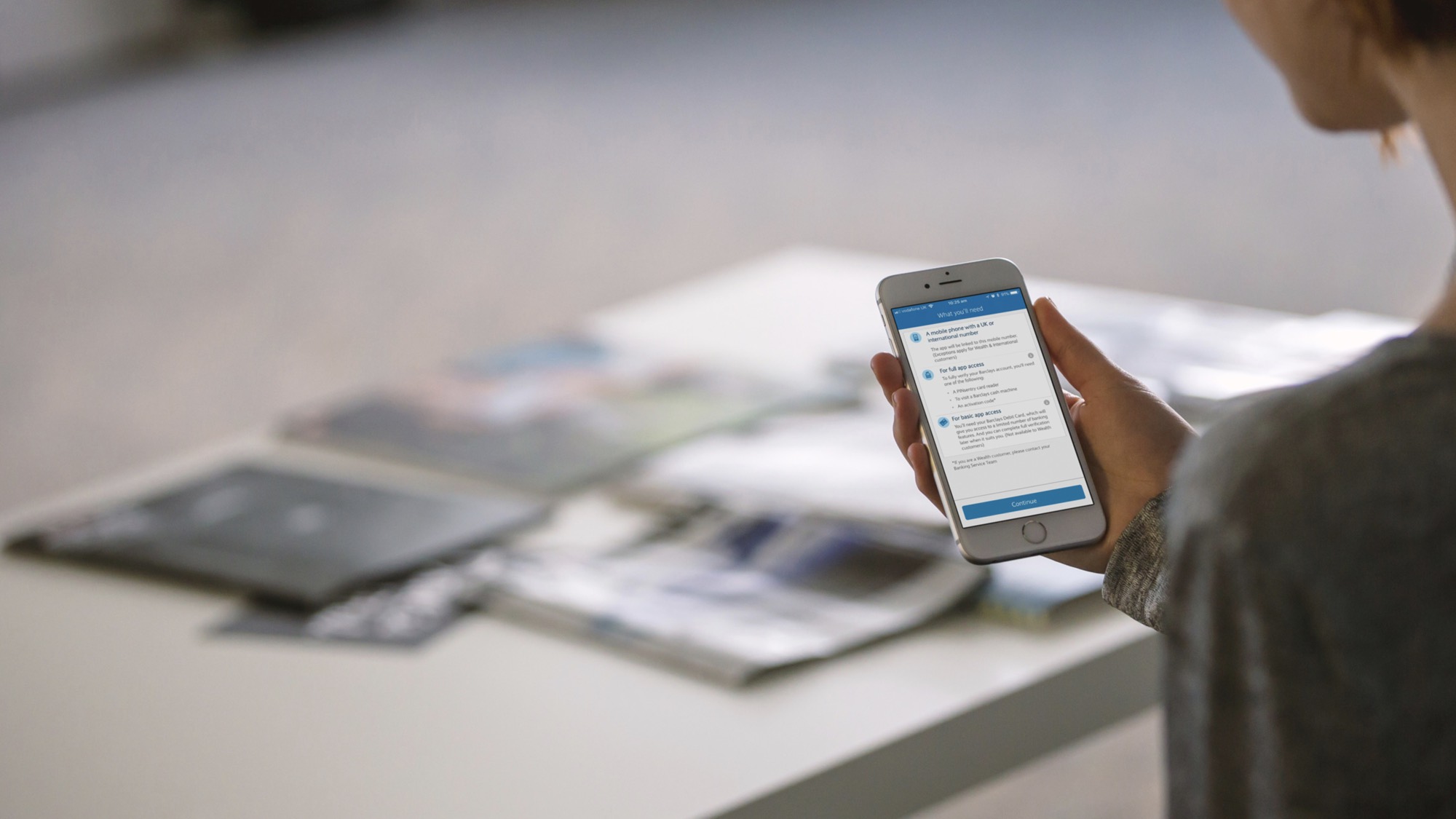
A pre-registration screen at the start of the journey showed users the steps ahead and what they would need to complete their Barclays Mobile Banking registration.
Debit Card Verification
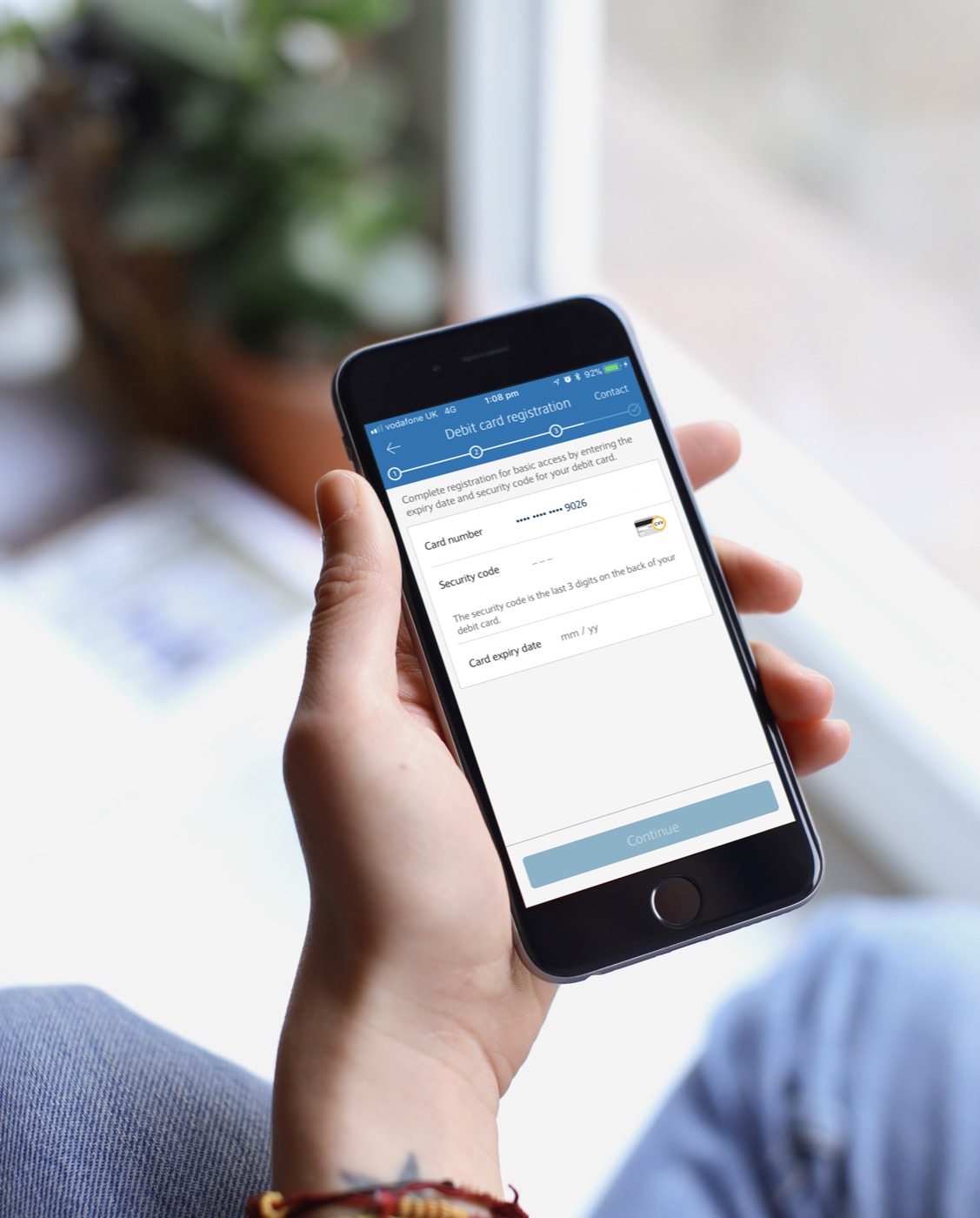
Security meant we couldn't remove the ATM or PINsentry step: features like payments and transfers still needed it. We did add a new basic app access option, where users could register with just their debit card details to view their balances and transactions. It was quick, simple, and could be done anywhere, any time.
Upgrade Stimulants
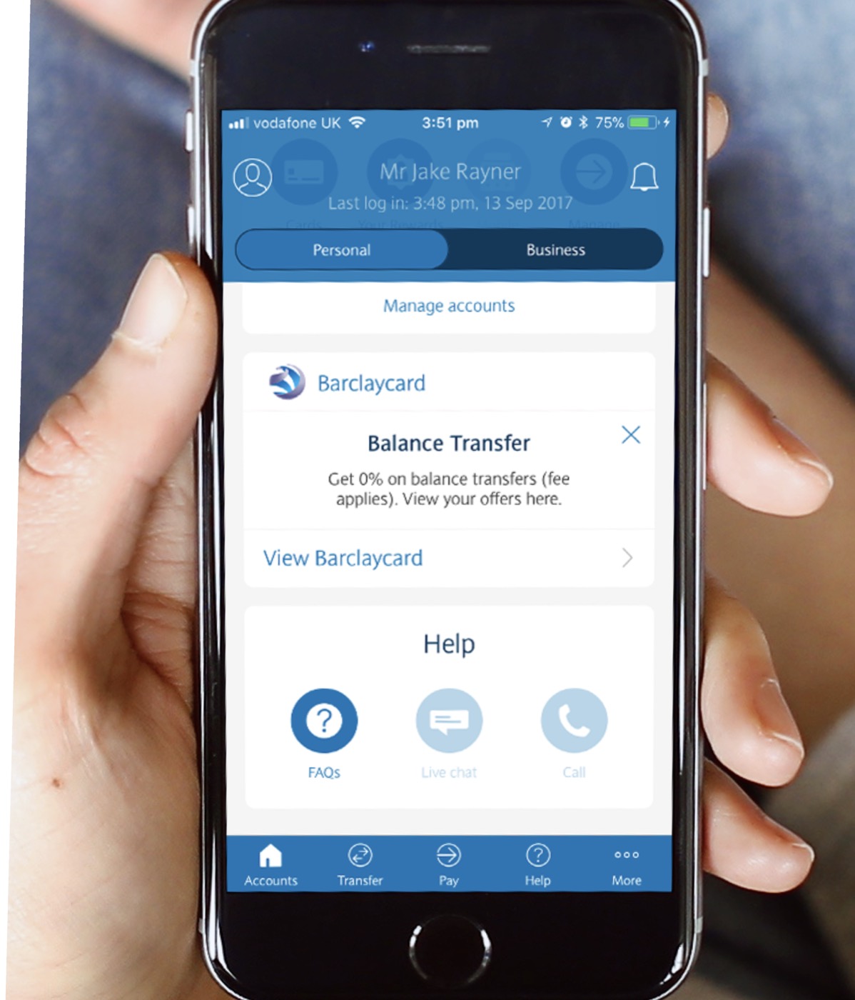
Users could complete the ATM or PINsentry step at any point after registering. High risk features were shown with disabled icons, so it was clear what needed full access, and tapping one opened a modal explaining how to upgrade. The copy was written to encourage the upgrade, with phrases like "gain" and "full access".
Post Project Analysis
The feature resulted in an 80% increase in completed registrations. Active users increased from 3.8 million to 5 million.
Discovery, design exploration, user testing and final design delivery were all completed in 3 weeks.
The project took around 6 months from inception to go live.
I stayed engaged in the project after design delivery, reviewing builds and supporting the developers.
B-Tap
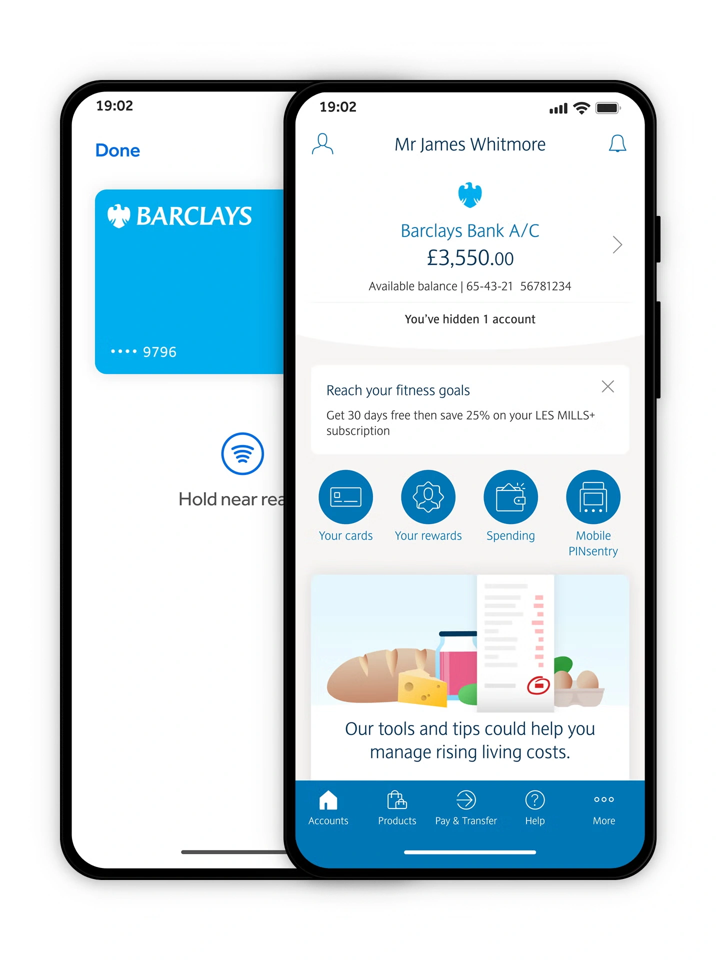
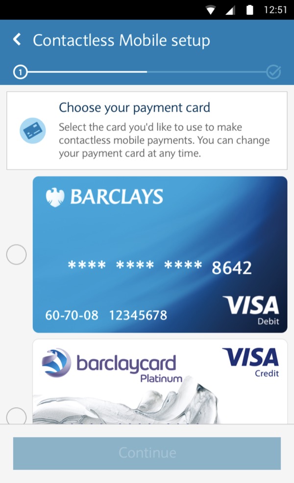
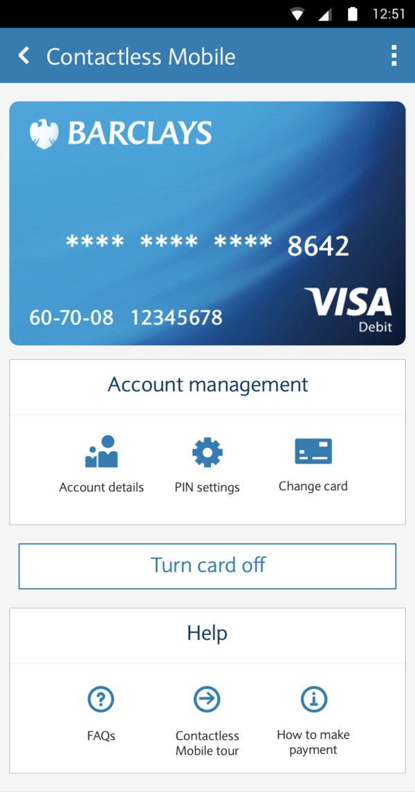
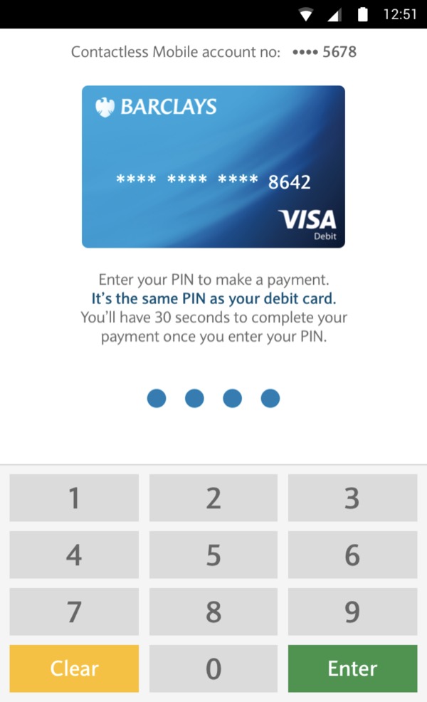
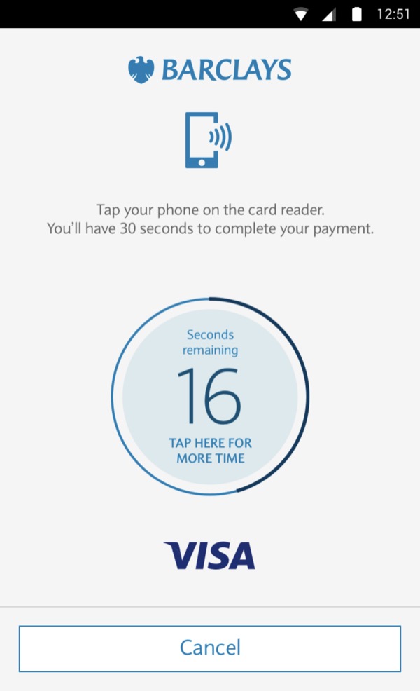
Following the launch of Visa contactless payment and Apple Pay, Android Pay was released in early 2016. Unlike Apple, Android allowed contactless payments to be built into an app, as an extension of the app's functionality and experience rather than something standalone or baked into the device's operating system.
I ran a small discovery project to understand whether customers would want a Barclays-branded solution for Android Pay, which told the product team whether the project was worth running. It was. I presented my findings, the project was approved, and I designed and delivered it in full.
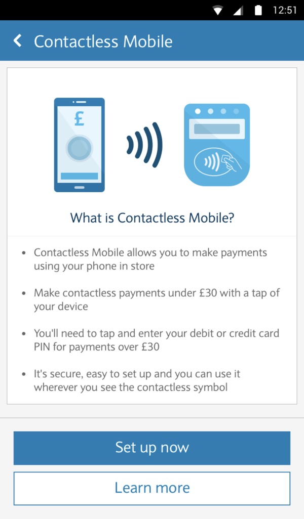
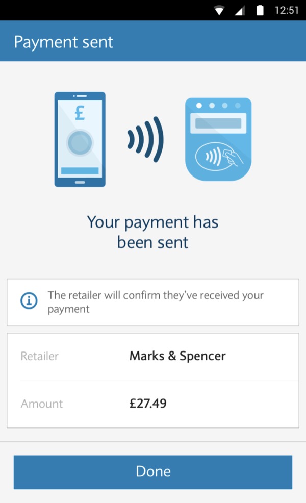
The output was B-Tap, the Android contactless payment solution by Barclays, letting customers make contactless payments using just their Android device and the Barclays Mobile Banking app.
More Work at Barclays
Before joining the Mobile Banking team, I spent a year in the Barclays Innovation Team as a UX/UI Designer and Creative Consultant, designing early digital banking products and concepts across iOS, Android and web for Barclays and partner organisations such as Childline and Microsoft (Windows Phone), and producing video, animation, print and digital creative work in a small in-house team.
Change of Address
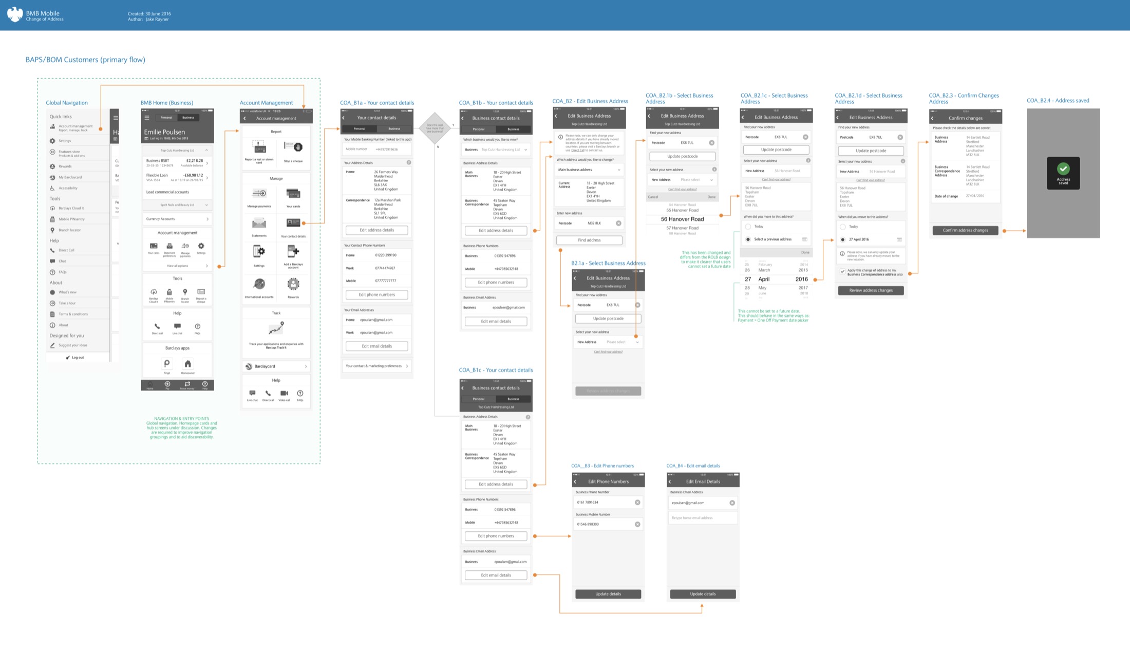
View and edit your address details in an instant.
Single Rewards Destination
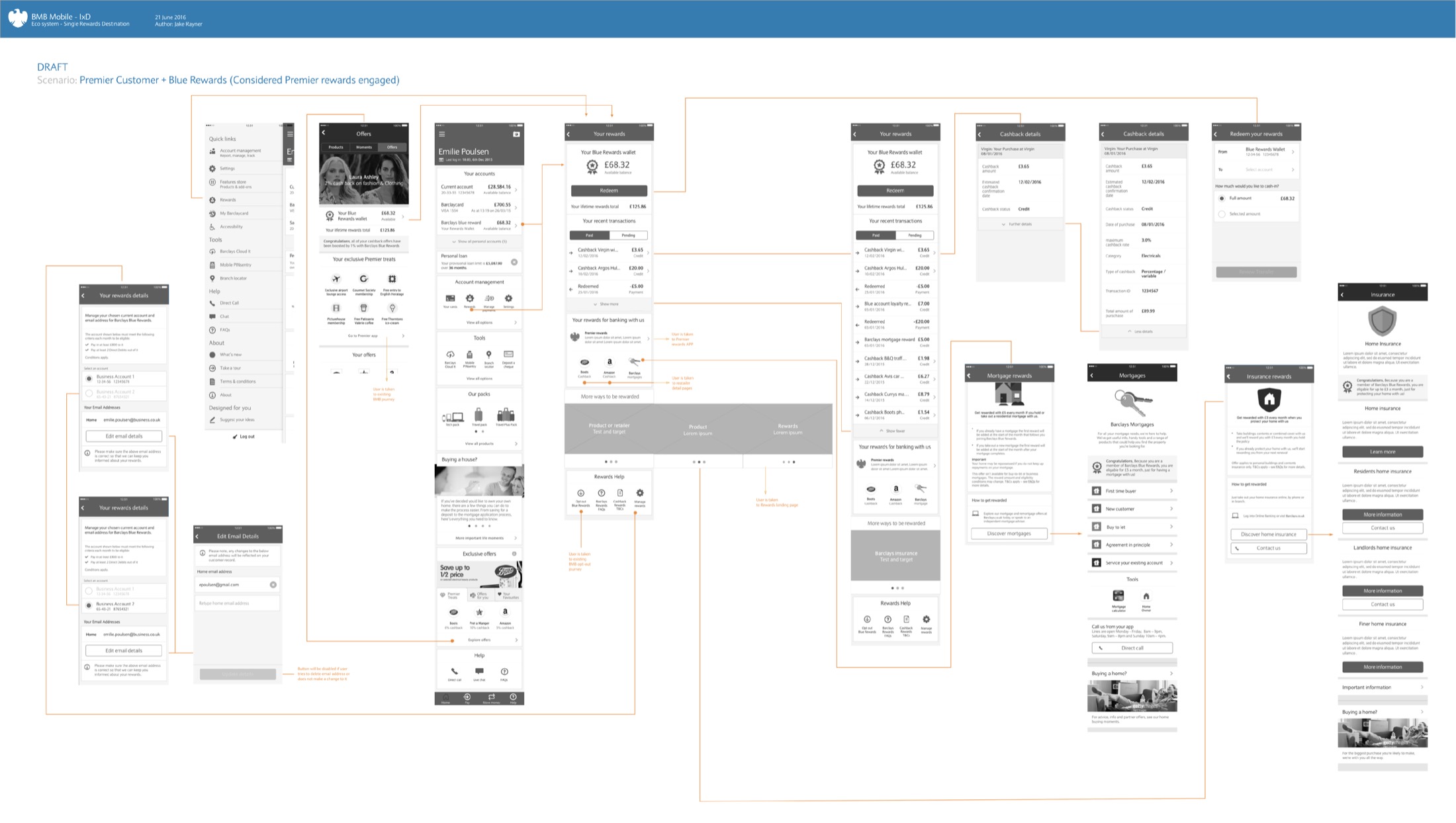
Review, manage, withdraw and spend your Barclays Blue Rewards balance.
Manage Expedia Bookings
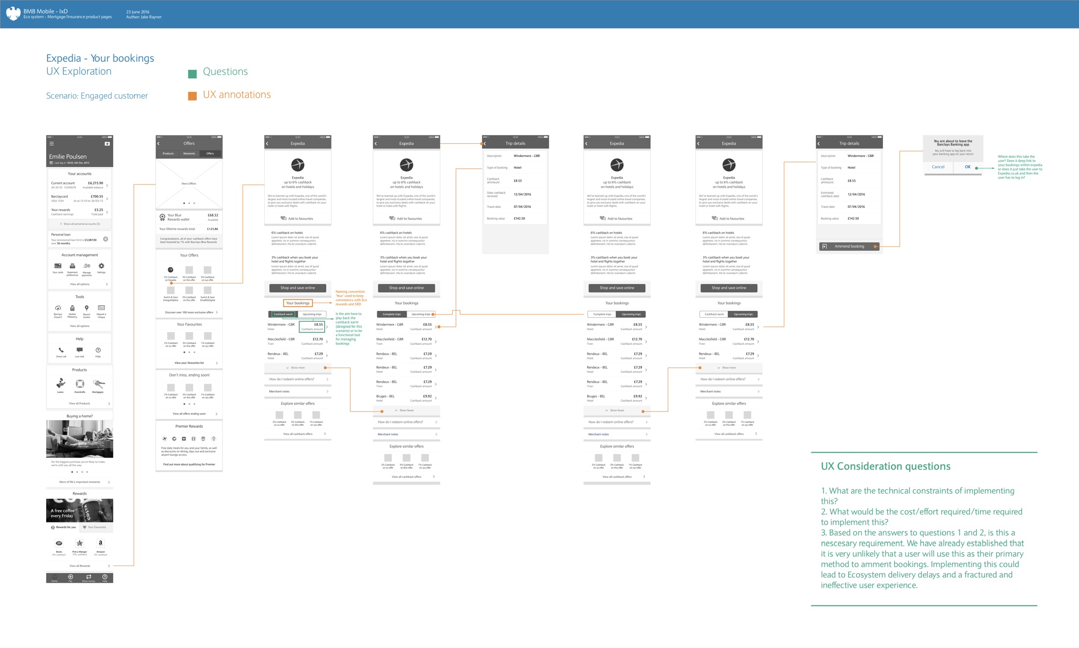
Review and manage Expedia bookings placed with your Barclays Blue Rewards account.
The exploration came with UX consideration questions: the technical constraints, the cost and time to implement, and whether it was needed at all, given users were unlikely to make this their main way to amend bookings. Building it could have delayed delivery and fractured the experience.
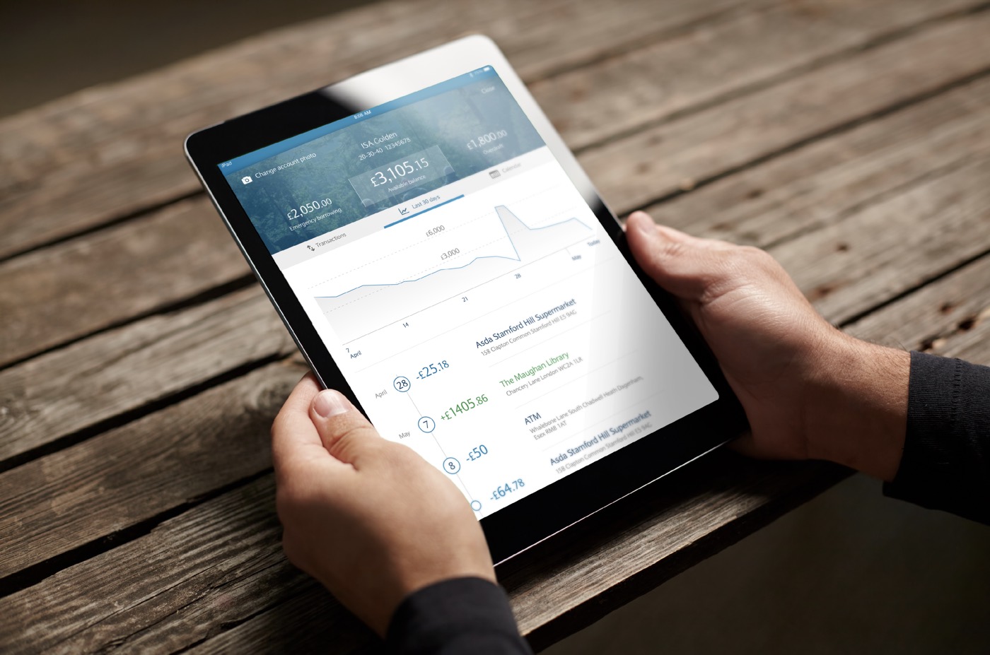
Mobile Banking 2020 Concept
I was tasked with designing "a mobile banking app of the future": conceptualising non-conventional ways for users to navigate a mobile banking app and manage their accounts.
It was a rapid, conceptual project I worked on alone. I gathered user feedback on other live digital banking platforms from the customer service and data analytics teams, and did my own benchmarking and research into emerging technology, focusing on new forms of interaction. From that I defined the requirements, followed my own design process, and presented the concept to senior stakeholders in the UK mobile team, including the Head of Development and the Principal UX Designer for Barclays Mobile Banking.
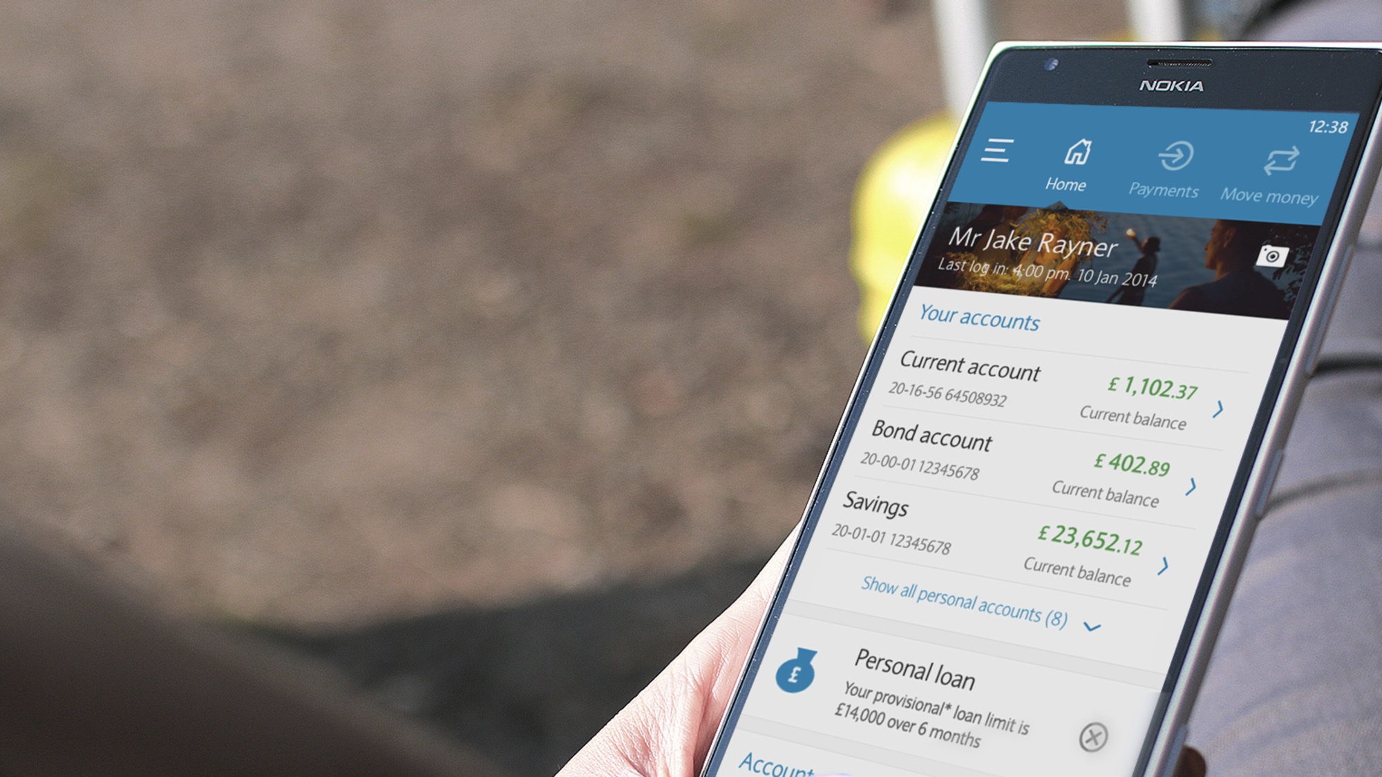
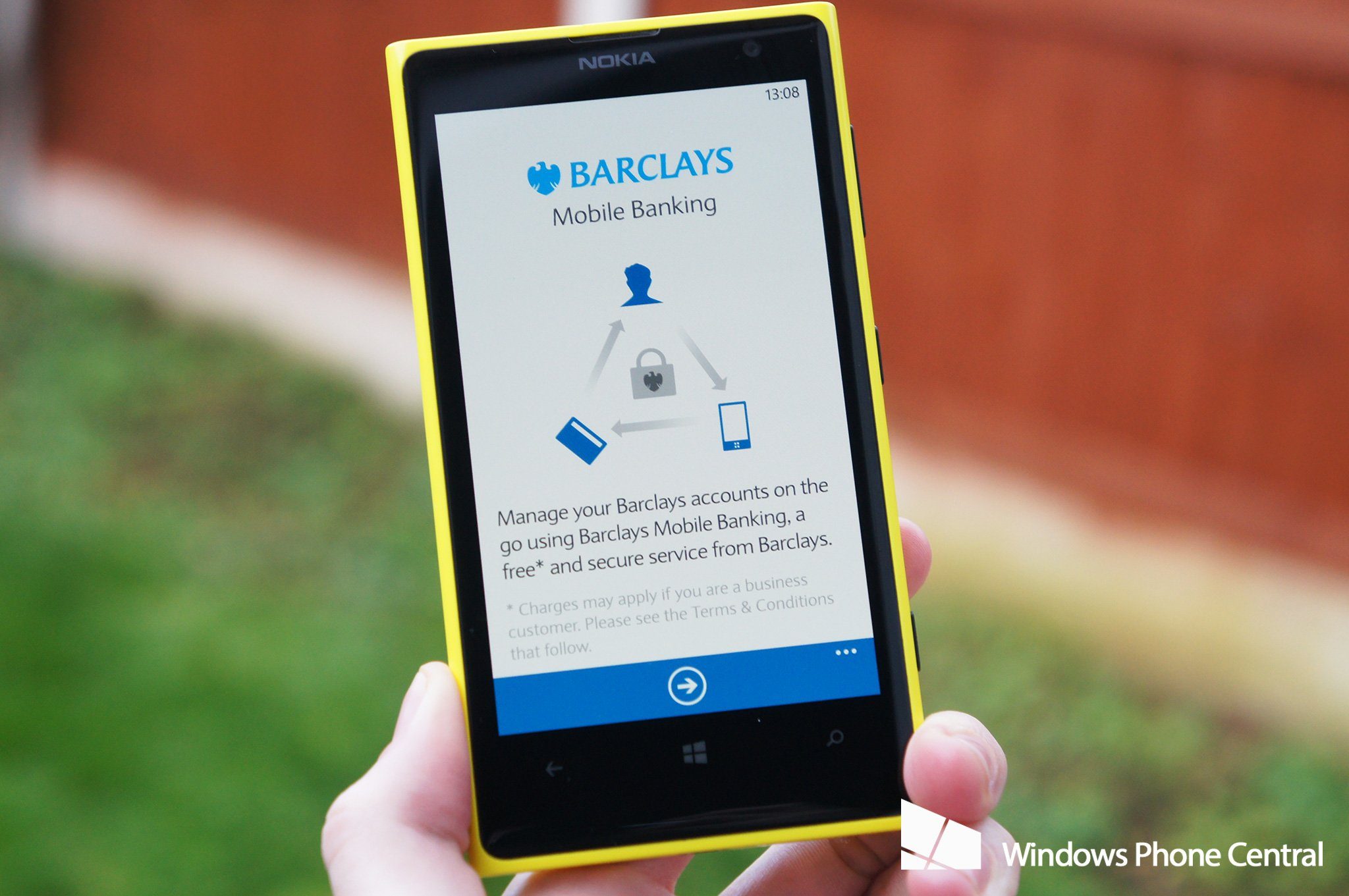
Mobile Banking for Windows Phone
I explored how Barclays could translate the existing Mobile Banking iOS and Android design into a Windows Phone app, after Windows Phone devices had grown in popularity.
The screens I designed were used in a TV commercial, which I also helped to shoot and edit, for the launch of a new Windows Phone that came with Barclays Mobile Banking pre-installed. I also explored a new onboarding journey that let people without a Barclays account open one using just the Windows Phone app, in under 30 minutes. That prototype became the basis for the whole Barclays Mobile Banking app for Windows Phone.
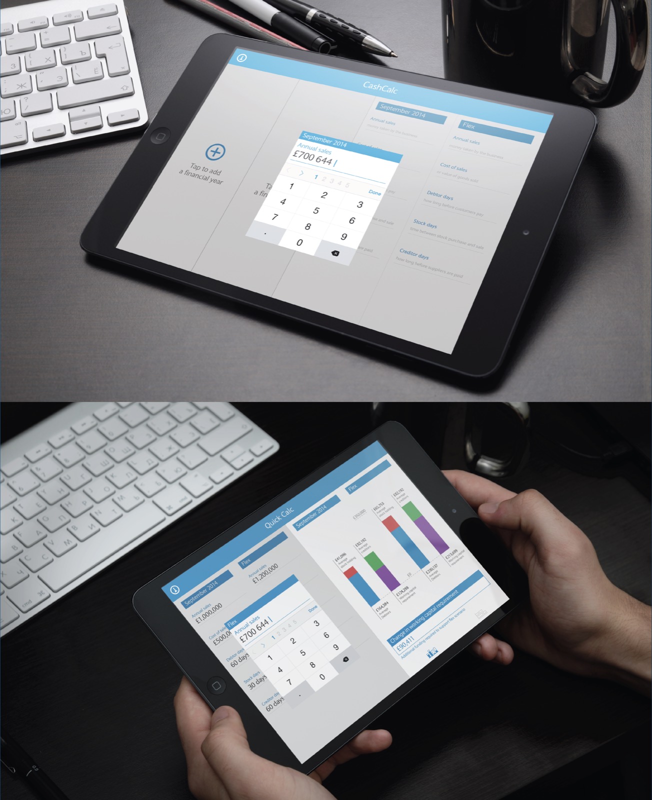
Cash Calculator
An app for Barclays Business Managers (BBMs) to use with their small and medium business clients, helping them manage cash flow and future financial projections.
I set up several focus groups with BBMs to understand the problems in their current processes and tools, then designed the Barclays Cash Calculator: BBMs could input large quantities of data, calculate a client's future finances and visualise a business's cash flow with animated, interactive graphs in less than 5 minutes. Clients came away understanding their finances much better, and BBMs got time back to spend with customers.
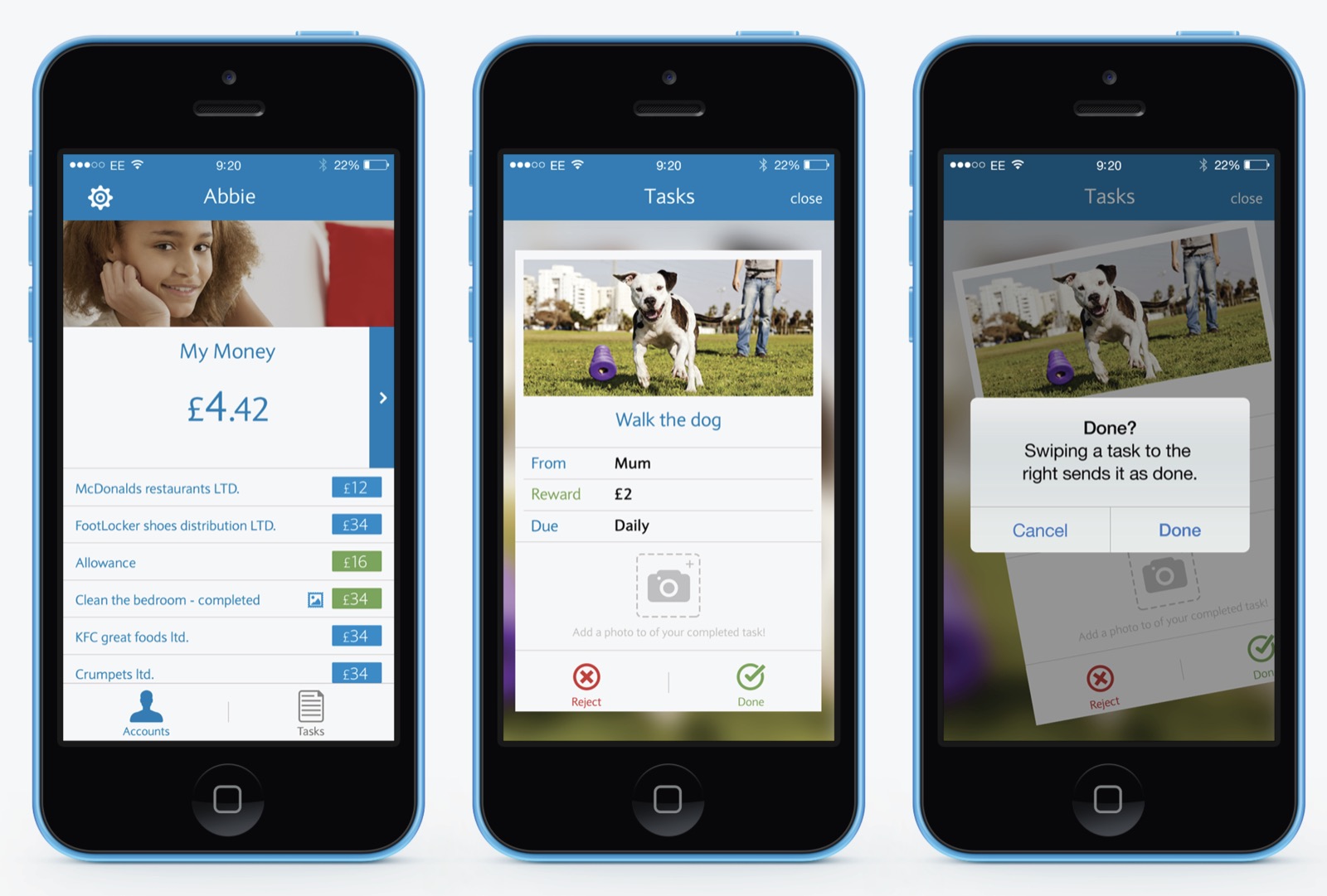
Pingit Junior
A project initiated by the innovation team, built on the technology behind the live Pingit app. A single developer and I ran it autonomously, presenting our findings back to the digital leadership team.
I researched and designed a platform that introduced children to money management at an early age. Our mantra was to bring pocket money into the digital age. A linked parent and child app let parents set tasks, like cleaning a bedroom or walking the dog. The child photographs the finished task and sends it to the parent, who then adds money to their child's Pingit Junior card to spend.